
Scratching My Way Back to the Pulp Era,
Or, How to Do State-of-the Art Illustration…Circa 1933
By Bradley K McDevitt, Editorial Assistance by Carol Karbowiak Gilbert

Virgil Finlay
Goodman Games prides itself on publishing works that harken back to a golden age of gaming. In many ways that golden age of gaming is closely connected with the golden age of pulp magazines, since most of Appendix N was originally published in pulp format. Those original pulp publications were accompanied by illustrations completed in “physical media” – actual pen and ink, actual paint and brush, actual canvas and paper. In this modern year of 2019, such physical techniques are an increasing rarity among RPG publishers, most of whom publish digital art. At Goodman Games, we still publish a significant amount of art completed in physical media, particularly in our DCC line. Brad McDevitt is one of the artists who illustrates for us in traditional pen-and-ink media. Brad recently completed several illustrations for us in scratchboard, a physical media quite common in 1933 and virtually unknown now. In its heyday, scratchboard was popularized by well-known artists like Virgil Finlay and Hannes Bok. In this article, Brad tells us more about his return to working with a vintage technique that is rarely seen anymore.

Scratchboard as an artistic medium is not for the faint of heart. For one thing, it is increasingly hard to find without spending a small fortune, if you can find it at all. Most arts-and-crafts stores do not stock it, and increasingly few actual art supply stores do either. For the project I bought mine for, Goodman Games’ Cthulhu Alphabet, I eventually found some on Amazon, along with some tools for doing it with. It was kind of annoying to have to hunt that much just for some art supplies, but I felt I had a good reason.
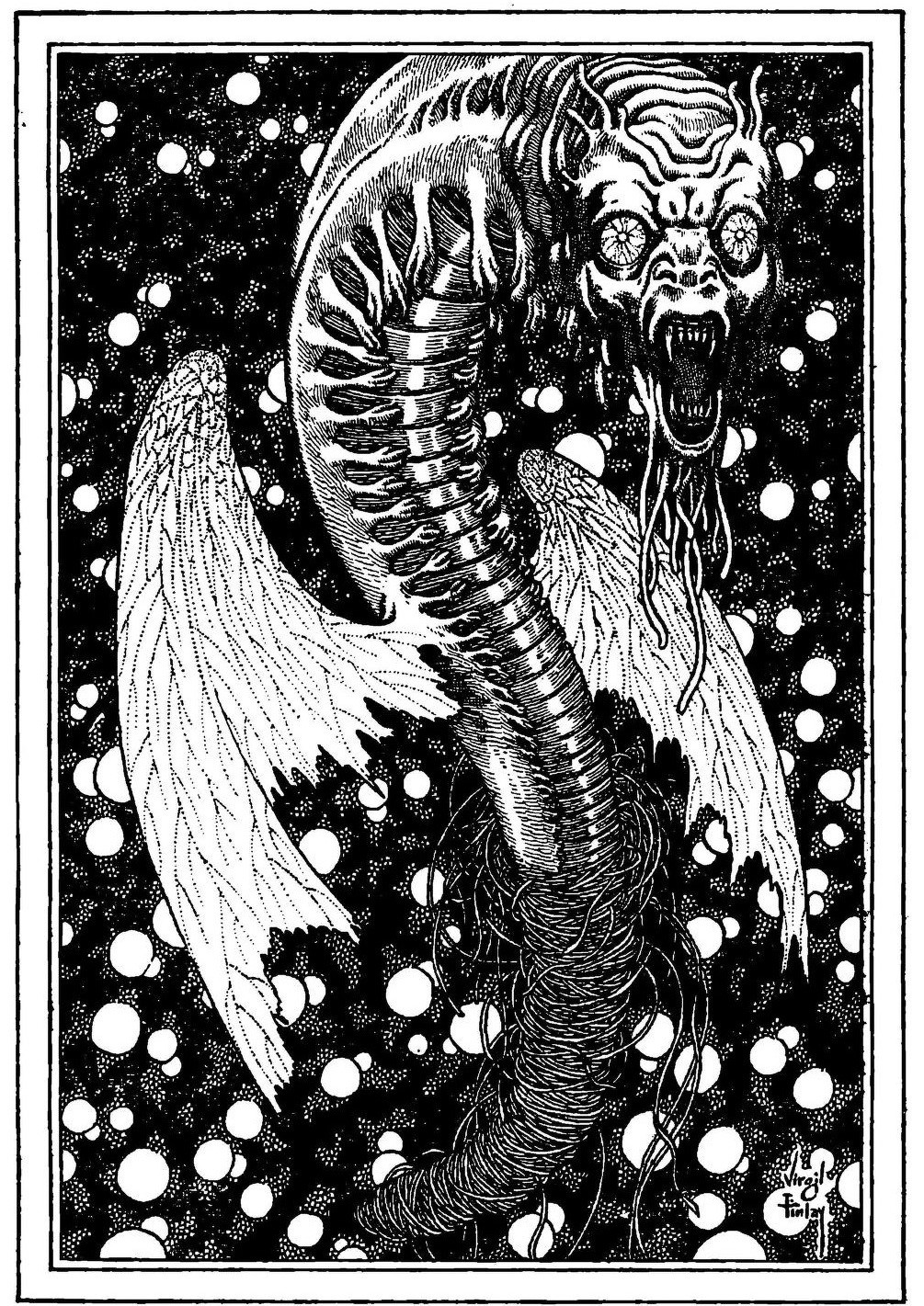
 You see, scratchboard and horror have gone hand-in-hand since the days of the pulp magazines which helped spawn the Cthulhu Alphabet. Artists like Lee Brown Coye, Hannes Bok, and pulp-art maestro Virgil Finlay all employed scratchboard extensively. Many of Lee Brown Coye’s most infamous images, like this illustration of a moldering cadaver for Ray Bradbury’s The Black Ferris, were done on scratchboard.
For readers who are unfamiliar with scratchboard, here is a quick reminder – since it is basically a lost art, and few people ever do it after junior high art class. As for myself, in truth, I had not tackled any since my own high school years. But when Goodman Games proposed I pick up the bulk of the art for the Cthulhu Alphabet, I knew I had to do at least some in that venerable media.
But how does scratchboard differ from normal drawing? For one thing, the very paper is different. Usually, scratchboard comes on a thicker paper, almost like posterboard. It is also coated with a thin layer of glossy clay. At this point, the scratchboard still needs to be prepped, usually by painting over the surface with India ink. After letting the ink dry (usually overnight at the very least), a sharp tool like an X-acto knife, pen knife, or an actual scratchboard tool, is used to delicately scrape through the ink, revealing the white clay underneath.
It is an unforgiving medium. With a normal drawing, mistakes can be covered up with liquid paper, white acrylic paint or Pro-white, an opaque white paint much like watercolors, but much thicker. With scratchboard, hiding mistakes is a much more difficult proposition, without inking over the section again and hoping that not too much of the clay medium was scraped or cut away.
But if you can get it to work… it is worth the effort.
At the request of Joseph Goodman, I have done a few pieces, and will now share the various steps of the process with you… mistakes and all.
Not shockingly, the first thing to do for a commercial job like this, is to figure out what to draw, if the client did not take pity on you and give you a précis on what they wanted. In this case, Joseph Goodman gave me a wide margin of freedom to determine what images I thought would best bring the entries to life. This meant I spent many, many nights (weeks, months…) re-reading Lovecraft and his followers. In specific for this entry, the image needed to be for R from the story The Horror at Red Hook.
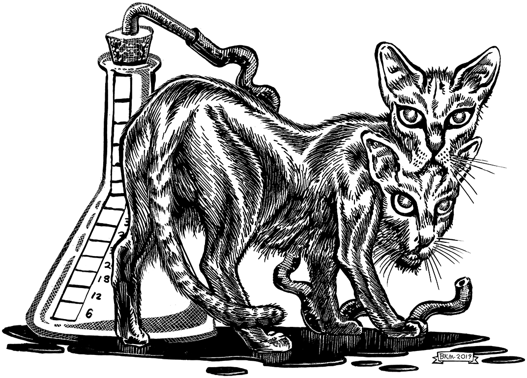
Re-reading the story, a small vignette popped out at me, of the main character (Detective Malone) seeing a deformed cat while investigating a subterranean laboratory. And it seemed a good candidate for at the very least a spot illustration in the article.
The next step was to sketch out the image onto some scratchboard, which also involved some time Googling for pictures of cats and laboratory equipment… always a fun combination.

Step 1
Once I was satisfied with the overall pose, I drew a believable second head on the cat and received approval from Goodman Games, then I went to the next step. This involved essentially almost-finishing the image in ink. Many people who work with scratchboard, it is my understanding, use prepared (already black) board. I prefer to use the board that can be drawn on and inked normally. About two hours of careful brushwork gave me this image. As you can see, there is a variety of smudges and pencil marks clearly visible at this stage, all of which will have to be dealt with before the piece is finished.

Step 2
The next step is the one that, I suspect, stops a lot of commercial artists from using scratchboard: Setting the piece aside for at least twenty-four hours to let the ink dry completely. In the deadline-oriented world of art-for-hire, such delays are usually more than most artist are willing or capable of waiting out. But in this case, I had other images to work on, so it went on a shelf where it would not be disturbed to cure.
The following evening, I got to work on the final. There are various scratchboard-specific tools available… none of which seemed to really work for me to my satisfaction. I ended up using a typical X-acto knife of the sort easily available at any craft store, or in this case, the art aisle of the local Walmart. Since I had done a really detailed ink drawing to start with, the scratched-out lines (to show the underlying white) acted more to enhance a nearly finished illustration, adding texture to the cat’s fur, as well as details in the eyes, face, and to show more details and highlights on the flask and tubing. As can be seen, at this point, the image is almost done.

Step 3
My next step involved coffee and patience… letting the image “rest” and then examining it again to see if I was satisfied with how it looked. In this case, I was pretty happy with the finished product. I brought out a few details with my trusty ink marker (the one eye needed some touch-up), along with a few other details bringing out a few additional additional details on the cat’s fur.
The next step was simply to erase my construction lines. Sometimes, there is a step where the artist goes over the image after erasing the extra lines and brings out last minute details and corrections using either white acrylic paint or Artist’s Pro-white, which dried very quickly. This allows the painted-over parts of the image to be inked over even more, in case the artist feels it needs even more details. In this case, I was happy with the image as was and was able to skip at least this step… I have gone to this extent with other images done in scratchboard at times.
Being OCD is not always a bad thing when you are an artist.
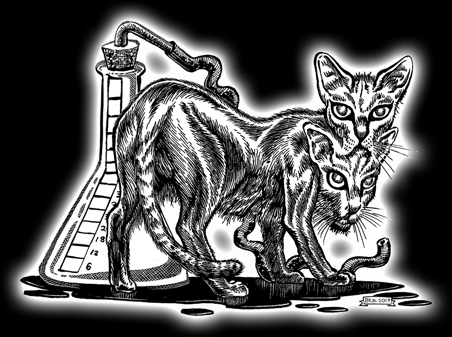
Finally, the image went onto the scanner to be digitized and truly finalized. A tip to those of you who don’t work in art: very little physical artwork actually gets sent to clients anymore. Digital files, in this case prepared in Adobe Photoshop, are the rule of the day. I scan scratchboard pieces as grayscale at 600 ppi, which renders the image in excruciating detail on screen. Since I usually work at 150% of printed size, this means images end up at 540,000 pixels per square inch to work with for making sure the final image is as crisp as possible. It’s usually a good idea to save the image now as a native PSD (Photoshop Document) before you go any further. Skipping that step is asking for a computer crash… and in this case, I speak from literally hundreds of times of personal experience.
In this case, cleanup-was simple. Using the mask tool, I selected large areas to clean away smudges, then using the standard erase tool set to 100% opacity and hardness to clean up any areas I felt were too close to the actual image to risk including in the mask before I hit the “Erase All within Mask”… i.e, the Enter button. As an aside, I often save multiple times under multiple file names. Being OCD is good, so are multiple levels of redundancy in case of crashes, freezes, power losses or the cat stepping on the wrong key as it walks across the keyboard. Tedious, but necessary… the precautions, not the cat.
Step 4
Satisfied, I saved one last time, as a 600 ppi tiff, a good file format that works across multiple operating systems, and the piece is done except for adding a glow at the last minute to make it even creepier looking for placement in the layout document… but that is a story for another time.
Step 5
As you can see, even not counting having to add multiple steps of extra painting and inking the finals, doing illustrations in scratchboard give effects that would be almost impossible to do with typical pen and ink. Personally, I am thrilled to have been given this chance to experiment in this venerable media. The 21st century may be all about new media and CGI, but for me, I prefer the slower and more craftsmanlike techniques like scratchboard. Maybe they will see a renaissance some day, but in the meanwhile I am happy to be the best artist today pretending it is 1933.
Hannes Bok