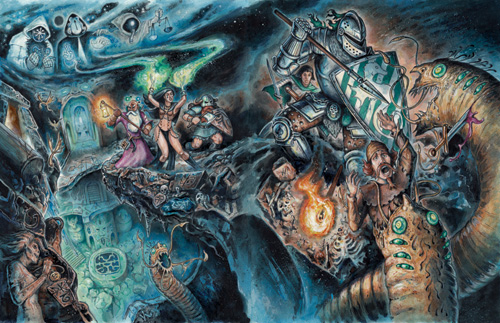
The interior* cover artwork (at least of the Kovacs pyromancer version I have) strikes me as far more marketable. It's evocative, eye-catching, and indicative of DCCRPG's distinct play style. You have people getting devoured. You have heroes of multiple classes looking cool and heroic, and appealing to various gamer types. The art catches your eye and all but forces it to linger. You've got a god of law fueling a sorcerer's spell while a god of chaos breathes life into the worms she is fighting; as your gaze drifts from detail to detail, you realize a rich story has been laid bare before you.
Compare that to the artwork reused for the main version, I think for all four printings.
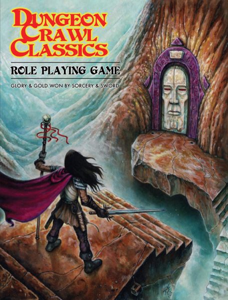
What have we got? A single figure--alone, solitary--standing, stationary, across a precipice from a blank, unemotional face. Browns, blues, no striking colors. A lull between the action.
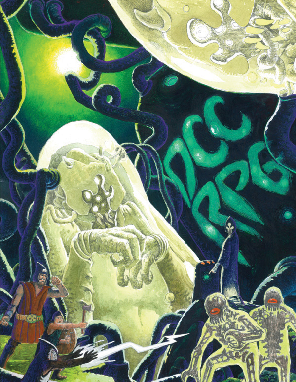
I adore DCCRPG and I want nothing more than for the brand and for Goodman Games to to succeed. I humbly suggest that with the next printing a more appropriate cover be considered. Peter Mullen's new cover is a step in the right direction--it feels very appendix N, and the metroid / sci-fi feel certainly distinguishes it from all of the high fantasy games out there. The Kovacs pyromancer is too, I suppose, but there are no heroes; it's just the villain standing there with flames whipping about him.
My suggestions to Goodman are to a) include at least three classes showing off their coolest skills, b) depict at least one hero dying spectacularly, and c) suffuse everything with the overwhelming, mind-sliming Appendix N flavor you and your artists are so good at capturing.
Anyway, as a huge fan of the game and of the artists and artwork, wanted to throw this out there. Excited to see what others think of the various cover art.


